Great Dental Website Design is Crucial
There's no denying (unless your head is still in the dirt) the internet has changed the way people find dentists. Your dental office website may have been overlooked in the past, but it's more crucial than ever to invest in a website that HELPS YOU get more patients instead of turning them away.
This change has allowed new practices to gain market share with savvy digital marketing, while older, more established dentistries lose business (regardless of how great they are).
Common dental website design mistakes include things like loading time issues, lack of mobile friendliness, poor SEO structure, and missing click to call buttons.
But perhaps the most common mistake we see dental websites make is with their Call To Action... or lack thereof.
The Most Common Dental Website Mistake... No CTA or Call To Action.
No matter how great your website looks or how much traffic you get, no matter how great your social media photos look or how beautiful your emails are, if you don’t have clear calls to action, you’re missing out on a lot of new patients.
So what is a Call To Action (or CTA)? CTA's are how you get website visitors to do what you want them to do. For most dental offices, the primary CTA is to "Call Now To Schedule" or to "Book an Appointment Online".
But before you go adding every call to action you can think of, you need to understand that having more CTAs isn't better. In fact, having too many calls to action can confuse your website visitors and cause them to feel overwhelmed.
For example, even after looking at this graphic several times, I still have no idea what they want me to do.
It’s about quality, not quantity.
Your website should have 1-2 clear calls to action. So if you want new patients to call, ask them to call. If you want new patients to book online, ask them to book online!
How to Fix this Common Dental Website Mistake
First, you need to decide what you want your website visitors to do. Then you need to decide how to get them to do it. We achieve this for our clients with a combination of text, images, and buttons.
Large, easy to read buttons that encourage action.
People need you to tell them where to click and what to do.
For Example:
If You Want More New Patients Contact Us Today ... Seriously, if you want to grow your practice contact us today.
After you figure out the perfect text to use, you'll need to make sure your button or link works & is easy to read and gets the visitor to click.
Here’s a good example of a dental office landing page that clearly encourages the user to get a coupon.
Ensure your dental office phone number is always visible, calls when clicked, and has text like "Call Us Today".
You want to make it effortless on your website for new patients to call you. That’s why your phone number should always be visible.
Plus, when clicked, it should call your dental practice right away.
How do you set up a click-to-call phone number? Simply use the following as the URL and replace the fives with your area code and phone number: tel:+15555555555
**For the technical folks you'll want the href to look like this "href="tel:+15555555555"
Other Common Dental Website Calls To Action
- Encourage people to contact you via email, contact form, or book now button: Just like your phone number, you want to ensure your email address is very accessible on your website. Many people don’t like to chat on the phone or aren’t in a place where they’re able to. But if they know they can quickly email you, they may be much more likely to reach out.
- Include Your Physical Address In Your Footer with a "Get Directions Link": People should be able to locate your address in your footer and when they need directions they shouldn't have to copy and paste. Include a get directions link that opens up your google my business listing.
- Bonus: This also has a side effect of helping to enhance your local SEO since having more people navigate to your office from google maps can boost your map rankings.
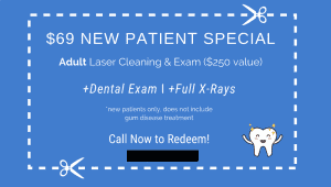
- New Patient Specials & Coupons for New or Returning Patients: One of the best ways to get new patients is to provide a new patient special. Our clients offer specials like "$49 for X-Rays & Exams" or "$69 for Cleaning, X-Rays, & Exams". You can also run promotions to fill your calendar up with current patients. Try doing a discounted teeth whitening offer.

The average lifetime value of a new patient is $8000, so discounting your new patient deals can greatly increase your long term practice revenue.
Bringing It All Together
If you want to get more patients and grow your practice, you need a fast, mobile friendly website that features clear calls to action.
Remember, more is not better. Users can easily feel overwhelmed if there are too many calls to action — even if they’re all asking for the same thing.
Focus on the quality and placement of your calls to action. When they’re optimized, you’ll get more conversions. And more conversions means more patients. It’s really that simple.
Of course, simple doesn't mean easy. If you want to hit the easy button, give us a shout today and let our dental marketing agency take care of it all for you.
Greetings Earthlings!
Ready to join our list of happy clients and grow your business? Request your free proposal now!

